Getting Started
Control Panel
Front End
Advanced
Meerkat's forms in version 2 were designed to be familiar if you are already accustomed to Statamic's forms. With that said, the two systems operate independently and there may be a few syntax differences between the two.
While most concepts are transferable between the two systems, this section will give you a more in-depth look at how Meerkat forms operate. If you need to get up and running as soon as possible, consider checking the Integrating Meerkat guide.
Meerkat forms provide access to a rich set of useful features such as validation messages, form success, failures, etc. To do get access to these features we can either use the {{ meerkat:form }} or {{ meerkat:create }} tag (they are completely interchangeable).
The following examples utilize markup and CSS classes from Tailwind CSS.
The following example demonstrates how to use this tag to create a new form. The example also shows you how to check if the form submission was successful or not, and how to display the errors generated by the internal validation systems.
1{{ meerkat:create class="w-full" }} 2 3<div class="-mx-3 md:flex mb-6 flex-wrap"> 4 5 {{ if success }} 6 <div class="w-full mx-3 border-green bg-green-light mb-4 px-3 py-3 rounded relative" role="alert"> 7 <strong class="font-bold">Success!</strong> 8 <span class="block sm:inline">Your comment was submitted.</span> 9 </div>10 {{ else }}11 {{ if errors }}12 <div class="w-full mx-3 border-red bg-red-light mb-4 px-3 py-3 rounded relative" role="alert">13 <strong class="font-bold">Oh no!</strong>14 <span class="block sm:inline">There are some issues to fix before submitting your comment.</span>15 16 <ul>17 {{ errors }}18 <li>{{ value }}</li>19 {{ /errors }}20 </ul>21 </div>22 {{ /if }}23 {{ /if }}24 25</div>26 27{{ /meerkat:create }}To create simple forms, you have the option to use the {{ fields }} value. This value will be an array of all the fields configured in the Meerkat blueprint. The following example demonstrates how to iterate all the form fields and render them to your site:
1{{ meerkat:create }} 2 3 {{ fields }} 4 <div class="form-group"> 5 <label>{{ display }}</label> 6 7 {{ field }} 8 </div> 9 {{ /fields }}10 11<input type="submit" value="Submit your comment!">12{{ /meerkat:create }}With Meerkat, it is simple to add additional form attributes to your Meerkat forms. The following example demonstrates how to add a custom HTML data attribute and a CSS class:
1{{ meerkat:create class="w-full" data-attribute="my-value" }}2 3{{ /meerkat:create }}It is also possible to create highly customized forms, and have complete control over the visual presentation of your comment form. While this is more involved, it will allow you to seamlessly integrate Meerkat forms into client project and design.
The following example was built using Cool Writings Statamic starter kit and Tailwind CSS.
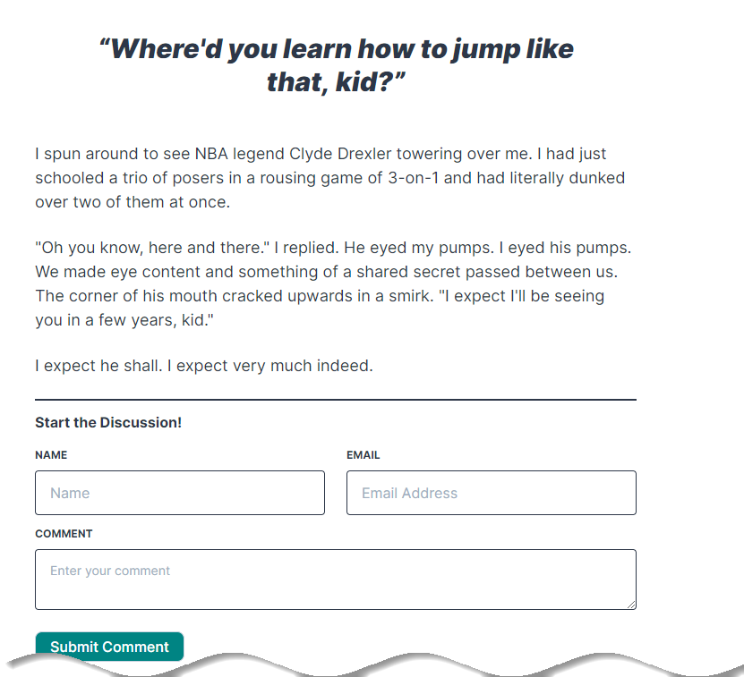
1{{ meerkat:create class="w-full" data-attribute="test" }} 2 3<div class="-mx-3 md:flex mb-6 flex-wrap"> 4 <div class="md:w-1/2 px-3 mb-6 md:mb-0"> 5 <label class="block uppercase tracking-wide text-grey-darker text-xs font-bold mb-2" for="comment-name"> 6 Name 7 </label> 8 <input 9 class="appearance-none block w-full bg-grey-lighter text-grey-darker border {{ if error.name }} border-red {{ else }} border-grey-lighter {{ /if }} rounded py-3 px-4 mb-3"10 id="comment-name" type="text" placeholder="Name" name="name" value="{{ old.name }}">11 {{ if (error.name) }}12 <p class="text-red text-xs italic">{{ error.name }}</p>13 {{ /if }}14 </div>15 <div class="md:w-1/2 px-3">16 <label class="block uppercase tracking-wide text-grey-darker text-xs font-bold mb-2" for="comment-email">17 Email18 </label>19 <input20 class="appearance-none block w-full bg-grey-lighter text-grey-darker border {{ if error.email }} border-red {{ else }} border-grey-lighter {{ /if }} rounded py-3 px-4"21 id="comment-email" name="email" type="email" placeholder="Email Address" value="{{ old.email }}">22 {{ if (error.email) }}23 <p class="text-red text-xs italic">{{ error.email }}</p>24 {{ /if }}25 </div>26 <div class="w-full text-sm flex flex-col px-3">27 <label for="comment-content"28 class="block uppercase tracking-wide text-grey-darker text-xs font-bold mb-2">Comment</label>29 <textarea id="comment-content" name="comment"30 class="appearance-none block w-full bg-grey-lighter text-grey-darker border {{ if error.comment }} border-red {{ else }} border-grey-lighter {{ /if }} rounded py-3 px-4"31 placeholder="Enter your comment">{{ old.comment }}</textarea>32 {{ if (error.comment) }}33 <p class="text-red text-xs italic">{{ error.comment }}</p>34 {{ /if }}35 </div>36 <div class="w-full mx-3 mt-6">37 <input type="submit"38 class="bg-teal text-white font-medium py-1 px-4 border border-gray-400 rounded-lg tracking-wide mr-1 hover:bg-gray-100 hover:text-teal cursor-pointer"39 value="Submit Comment">40 </div>41</div>42 43{{ /meerkat:create }}When building custom forms, make sure that your input element's name properties match those in your blueprint's definition.
There are a few key things to notice in the previous example:
error.name),old.name)The following amazing people help support this site and my open source projects ♥️
If you're interesting in supporting my work and want to show up on this list, check out my GitHub Sponsors Profile.
